A House for Life | Family Home Renovated with Universal Design
Photography by Kevin Hurley
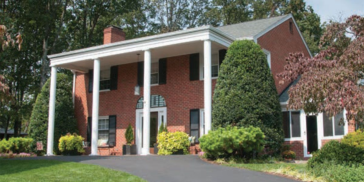
When Lee Anne and Jack Steffe moved to Roanoke in 1989, they knew two things: One, they wanted to return to Virginia where both had grown up, and two, they wanted a house they would never have to move out of. Both were busy medical doctors who had just completed their training and neither were fans of the home-buying process. Touring the 1961 brick Colonial in South Roanoke, the Steffes immediately felt it had everything they would need. With four large bedrooms upstairs plus a mother-in-law suite on the first floor, the house had enough room that they would not have to buy again as their family grew. Up on a ridge overlooking the Roanoke Valley, with a wooded backyard and ample parking, the home had both privacy and a view.
Fast forward 30 years or so, and Lee Anne, recently retired from her work as a pediatrician, started looking at the realities of their longtime home from a different perspective. No longer eyeing the home’s layout for a busy two-career family with very young children, now she looked at it as a place to retire and age in place. Jack, who still practices diagnostic radiology and teaches at the VTC School of Medicine, felt the same way. “We were young when we bought this house, and the reality of the laundry area being in the basement and our bedrooms on the second floor was no big deal,” he says. Looking forward though, would it be realistic or even safe? The Steffes were pleased with the cosmetic work they’d done on the house years before, but the reality was, that to stay in the house long-term, they’d need some major renovations. “We still love our house, and we wondered, just because the kids are grown and we are getting older, why does that mean we need to move?” says Lee Anne. “We felt there were things we could do to make this house work for us into retirement and beyond.”
Jack and Lee Anne put careful thought into what renovations would make staying in their home indefinitely not only possible and safe but enjoyable. With list in hand, they reached out to contractor Ken Potter of Potter Construction and interior designer Paula Linkous of Paula Smith Linkous Interiors to help them renovate their home to make it more accessible and allow them to consolidate their main living space on the ground floor.
Out front, the couple raised the driveway and porch to the level of the front door, creating a seamless, step-free entrance to the house. They also widened the front door, replacing the old one with a new, ADA-compliant door with a large glass pane and sidelights that flood the home’s entry with sunlight. An old European fence railing found at Black Dog Salvage has been crafted into a custom transom. “We think of it as outdoor art,” says Lee Anne.
Renovations inside began in February 2019. The Steffes moved to Smith Mountain Lake while the work was being completed, checking in on the progress about once a week. They tried to stay out of the way and rely on the expertise and professionalism of Potter and his team. “Ken was fabulous to work with,” says Lee Anne. “We are one of those rare families who had almost no hiccups through the renovations process. We loved watching the transformation and enjoyed interacting with the subcontractors that Ken Potter uses.”
Jack agrees. “The job really went so smoothly. We found Ken to be a careful planner, and very conscientious of timing and the impact of major renovations on his clients. He told us that we’d be back in our home by the last week of March, and that’s when he was done,” he says. Lee Anne also credits the smoothness of the process to their decision to hire interior designer Paula Linkous, who helped with many aspects of the project, including determining how the space would flow and function and choosing finishes.
With Linkous’s guidance, the Steffes decided to remove two walls to open the living room, kitchen, and what had once been a small breakfast room and a computer room into one free-flowing space, and, at the same time, exposing the home’s panoramic Roanoke Valley view to be appreciated no matter where you stood. “Paula’s biggest thing was the view,” Lee Anne says. “Everything she suggested was designed to showcase the view.”
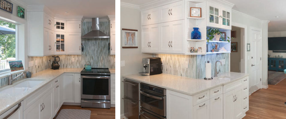
Linkous’s help was integral in pulling everything together, from the colors, to the furniture arrangements, to small but important details such as reframing the Steffes’ artwork to reflect the style upgrades. Lee Anne says she was also an integral part to mapping out the details of the kitchen renovation, which has completely transformed the space. White custom cabinets now go all the way to the ceiling, affording more storage than they had before, while other ingenious storage features have made the kitchen more efficient.
Influenced partly by their daughter, Jan, an enthusiastic environmentalist, but also by their own desire to make more sustainable choices, the Steffes made several “greener” choices with their design. For instance, instead of granite or marble countertops, they opted for “Icestone,” which is made in the U.S. from 100 percent recycled glass and cement. The backsplash is also made from recycled glass. The light-colored hardwood floors are not finished in polyurethane; they are instead coated with a 100 percent plant-based finish called Rubio Monocoat Oil. “We’ve been pleased with it,” says Lee Anne. “It has some real advantages over traditional polyurethane: it’s organic, it doesn’t give off fumes, and it goes on in one coat. However it is very sensitive to water; if you spill, you have to get it right up or you’ll get a dark spot. It’s just a little high maintenance in terms of care.”
The appliances are all energy-efficient state-of-the-art GE Profile. Lee Anne loves the refrigerator-only unit because it maximizes refrigeration space. For frozen foods, the Steffes had two freezer drawers installed on the other side of the kitchen. Lee Anne and Jack really love their induction range too, though it necessitated finding the correct cookware that worked with the range’s magnetic system. The kitchen also features a specialized wall oven that does triple duty as a microwave, convection oven and halogen speed-cook oven.
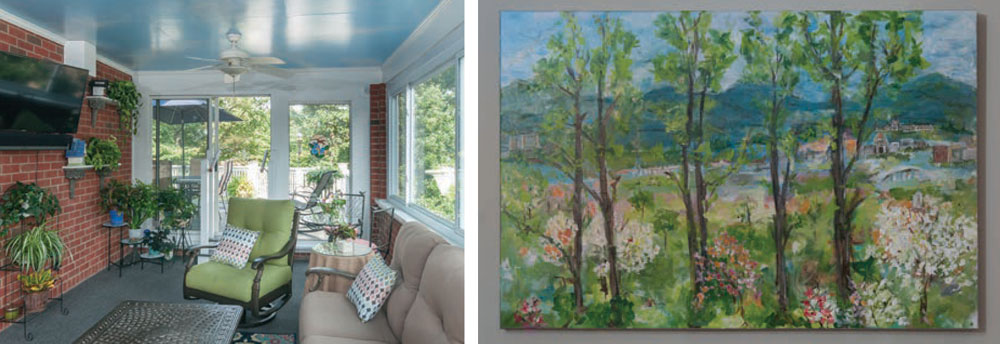
Off the kitchen lies an inviting sunroom, a transitional space with a relaxing vibe, great natural light, comfortable seating, and numerous houseplants. “I love to have a lot of green around,” says Lee Anne. The impression of an indoor garden is enhanced by the whimsical painted clouds on the ceiling. Brian Kinsey, also known as “Brian the Painter,” the craftsman who painted most of the Steffes’ home, added this flourish and Lee Anne loves it. “The clouds just make me smile, every time,” she says.
All the artwork displayed in the Steffe home has special significance. Above the sink hang pieces that Lee Anne and Jack brought back from a recent trip to Alaska, and a framed set of angel wings painted on metal that were a gift to Lee Anne from her sister-in-law when she was recovering from cancer treatment a few years ago. The kitchen’s open shelving also houses a number of family heirlooms. The shelves are lit with special LED lighting that can be adjusted to switch up the color and pattern (flashing/ fade/steady-on). “We saw these lights when we visited a kitchen that Ken Potter had done,” recalls Lee Anne. “Jack just loved it. In fact, it was the only thing that he insisted we incorporate into our kitchen design.”
In the family dining area hangs another special piece of art: a custom painting by Nene Roe, a local artist who also happens to be a good friend. The painting depicts what Jack and Lee Anne call “their view”—the one seen from their windows looking north up the Roanoke Valley. Nene added several personalized flourishes to the painting. For example, she zeroed in on several important landmarks for the Steffes: Roanoke Memorial Hospital, Lewis Gale Medical Center, the Steffes’ church, and the red Krispy Kreme “Hot Donuts Now” sign which the Steffes insist they can see from their home. “It’s just like the bat light from Batman,” laughs Jack.
The furniture throughout this space is comfortable and casual in style, and reflects Lee Anne’s preference for calming blues and grays. The walls throughout are painted “Sedate Gray” by Sherwin Williams. The dining table where the family takes most meals was built by Wayne Lamb of Born Again Wood, and represents another way to “upcycle” old furniture. “The table’s legs are legs from an industrial sewing machine table and the top is beams that were in the old C&O Railroad barn in Covington,” says Lee Anne. The enlarged living room boasts a new fireplace surround with a leathered-granite hearth, and over the clean lines of the white mantel hangs a crewel embroidery picture of birds stitched by Lee Anne’s mother.
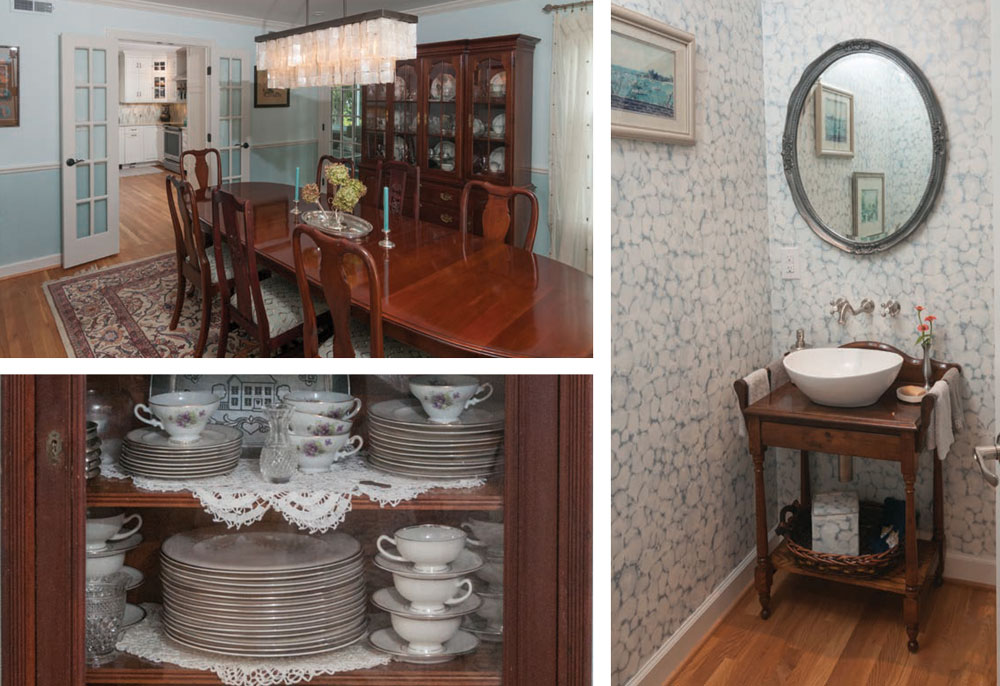
The Steffes preserved the home’s formal dining room mostly as it was, though it received a fresh coat of pale blue paint with a combed faux finish below the chair rail, and a glamorous new light fixture to replace the dated brass candlestick chandelier. Jack and Lee Anne proudly display a sizable collection of Depression glass, as well as both their families’ heirloom china and silver collections. Among the family treasures in the dining room is an antique bookshelf from the 1800s that belonged to Jack’s grandmother and a silver epergne purchased on a special trip to Charleston, South Carolina.
The traditional dining room suite is updated by the addition of two carved chairs that Lee Anne found at a local yard sale. “I was so certain I’d found these fabulously valuable antiques,” Lee Anne says. “I went online to investigate, and long story short, I found that my ‘fabulous’ antiques were likely…” Jack finishes with a laugh: “…From a local Chinese restaurant!” Lee Anne laughs too. “So maybe not quite the valuable find, but I still love them,” she says.
The renovation also helped the Steffes accomplish their goal of adding a large master suite and functional laundry on the first floor, replacing what had once been their master bedroom and 1960s-sized bathroom that did double duty as the family’s only ground-floor bathroom. A new powder room is adjacent to the living room and kitchen areas. Here, Lee Anne chose a beaded chandelier and a restful blue and white watercolor-patterned wallpaper. “The carpenters were so talented that we were able to repurpose a lot of our stuff in this renovation,” says Lee Ann, gesturing to an antique oak washstand that Jack’s parents gave to the couple early in their marriage. The antique was artfully converted into a sink vanity using a white porcelain vessel sink. The wall-mounted faucets add a historical look as well.
A short hallway connects to the new first floor laundry and master suite. An early portrait of the three Steffe children by Tracy Budd is now hung on the wall of the hallway that connects to the new addition. “It used to be over our mantel,” says Lee Anne. “But the kids got older and actually requested that we move it—so here it is, right where I can see it every night on my way to bed.”
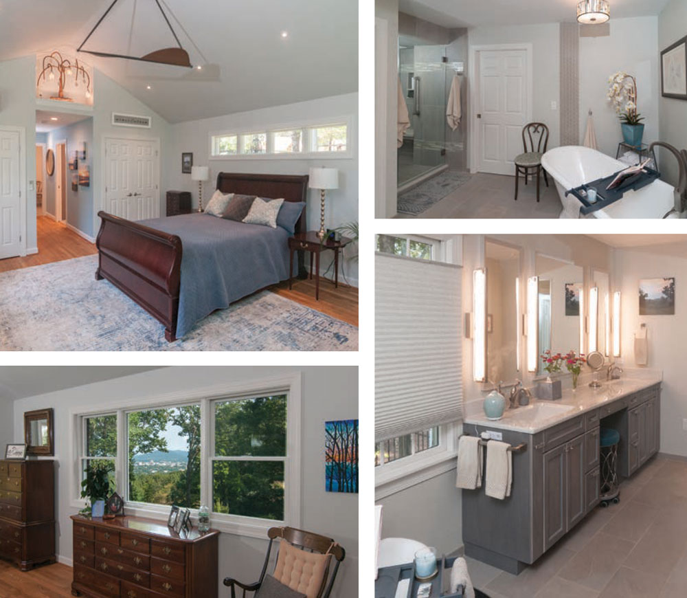
The large master bathroom incorporates beautiful design with neutrals: soft gray tile, gray custom cabinetry with cultured marble countertops, pale gray walls and smart precautions such as wider doorways and shower grab bars to make life easier as the couple age. Custom cabinetry extras include a built-in vanity with a rolling stool that the carpenters customized for Lee Anne. A freestanding soaker tub set at an angle with artistic vertical tile “border” complete the sense of tranquility in this spacious master bath.
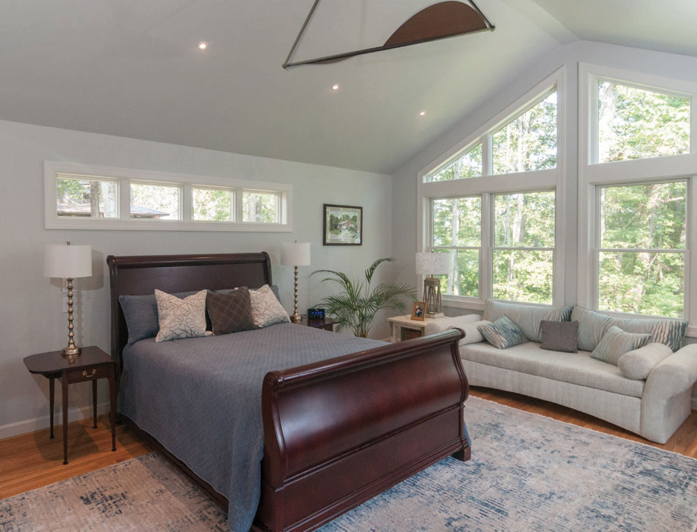
The master bedroom beyond is one of those rooms that elicits an “ahhh” just walking into it. With cathedral ceilings and unadorned windows on three sides to capture more extraordinary views, it feels like a room suspended in the treetops. “I feel a bit like I’m in a treehouse when I’m in here,” says Lee Anne. The master bedroom does evoke a treehouse feel—albeit a luxurious one. The colors here are Lee Anne’s signature soothing grays and blues, but the eye is instantly drawn to the unique piece of sculpture in the nook over the door. Here, B.J. Carter, a mixedmedia artist (and plumber’s son) created the sculpture from leftover pieces of the Steffes’ renovation. The “floral” creation is evocative of the art nouveau style, with its sinuous stems and flowers—except the stem of this “flower” is piping from the old shower’s copper pipes, and “petals” and “leaves” are made from leftover tiles from the kitchen and bath. Talk about reuse and recycle!
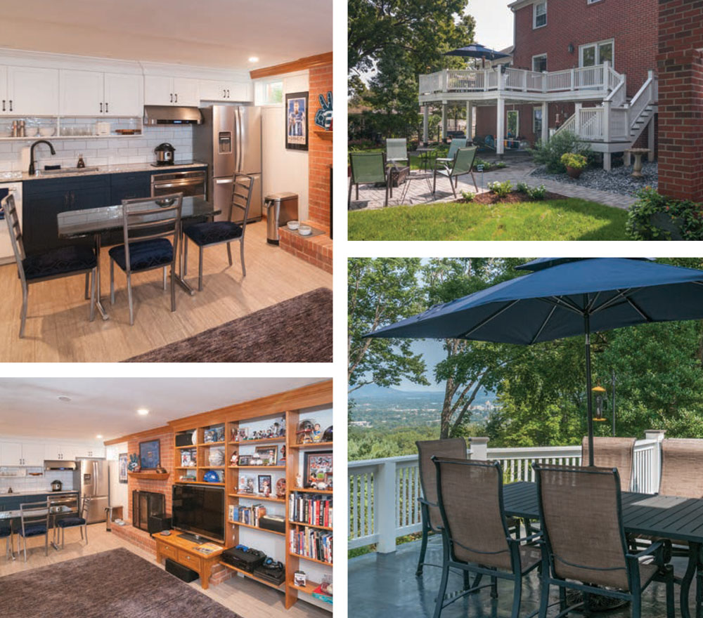
The basement also received a repurposing during the renovation. Once a dark bastion of laundry facilities and a hangout area for the Steffe children, the basement was transformed into a sleek apartment for Jack and Lee Anne’s son, Will, their resident grad student. To this end, Lee Anne, Jack and Will designed the updated space, adding a bedroom, a kitchen, and a separate entrance.
The Steffes’ home is built into a hillside, so the landscaping has to accommodate that. The sunny backyard was designed by Melissa Hodgkinson of Fiddlehead Landscape and Garden Design and installed by Roanoke Landscapes, and features undulating beds of shasta daisies, calla lilies, chrysanthemums, sedum, lily of the valley and ferns. The patio, also installed by Roanoke Landscapes, is constructed of cement pavers, and provides level ground for the family’s firepit gathering area.
At the back of the house is a low brick retaining wall built to accommodate the basement bedroom addition. As the wall was going up, the couple had the idea to include two commemorative bricks recognizing the changes the home has undergone. The first brick is engraved “EST. 1961,” to note when the house was built. “The bricks are a nice touch,” says Jack. “Most homes of this era were not designed to stay in forever, but we hope our choices here will allow us to do just that.” Next to it is a second brick. This one reads, “RENO 2019.” ✦
“greener” choices, 1961 brick Colonial, ADA-compliant, Custom cabinetry, family treasures, indoor garden, leathered-granite hearth, open shelving, plant-based finish, recycled glass and cement, renovations, repurpose, Sedate Gray, SunRoom, treehouse feel

