Design Conundrums | Designer Tips for Fixing Up Your Family Room


In every home there are bound to be certain design and decorating challenges. Who hasn’t tried rearranging furniture or art every now and then—whether to improve flow, make more room, or just try something new? When you’re looking at your own spaces, it can be hard to see things with a fresh eye. We might search Pinterest boards, magazines, and design websites for inspiration; we might ask a trusted friend for opinions and ideas. But nothing beats the help of a professional. Interior designers and decorators have the ability and experience to analyze a space and see what needs to be changed to improve both style and function. While every home is different, in their line of work, certain design challenges do come up with regularity. We talked to two local designers on how they handle three of the most common conundrums in a favorite spot—the family room.
TV + focal points
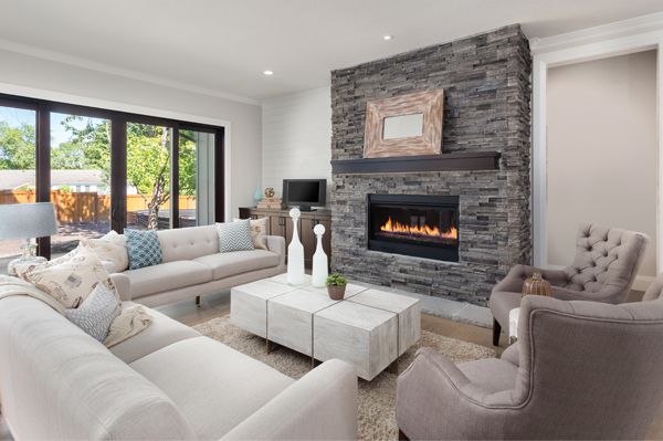
Almost every family room has a TV, and quite a few have fireplaces as well. Orienting both in the same space can be a challenge. MaryJean Levin, interior designer at Halifax Fine Furnishings, says that flatscreens have somewhat simplified the conundrum, since they can be mounted above the fireplace in certain situations. To integrate the two focal points, Levin says, “Continuing moldings above the mantel to fit the screen can make an attractive architectural feature. One caution about this installation is that the mantel should not be more than four to four-and-a-half feet high, because a much higher screen is uncomfortable to watch.”
Some homeowners prefer to camouflage the TV when it’s not in use. “Televisions are such symbols of the ‘community entertainment’ purpose of a family room that I discourage clients from trying to disguise them here,” says Levin. However, for those who do want it hidden here or in other spaces, there are several options. Samsung offers an LED Mirror TV which, as its name suggests, looks like a mirror when the TV is turned off. Samsung also has The Frame, which offers the choice of more than 800 works of art for display. Both models have customizable frames. If you’re looking to hide your existing TV, consider wall-mounted panels in an attractive finish. Antiqued mirror, reclaimed wood or even a large canvas can be slid or placed over the TV when not in use. There are also bookshelves and entertainment units with movable doors that can hide the TV when needed.
 Layout + space
Some family rooms—especially those situated adjacent to an open kitchen in the rear of the house—tend to have long, rectangular spaces that can feel a bit like a bowling alley. The conundrum here is how to make best use of the space while avoiding an awkward layout or blocking off access. “Divide and conquer is usually the best solution for a long rectangular room,” Levin says. “A small sofa across the middle of a long space can create a sitting area, with another area behind furnished with a game table and chairs. This is useful not only for games but also for casual eating and homework.” She also says, “If the room is extremely long, two small sofas back-toback can delineate the spaces.” Levin says her favorite solution for a difficult room layout is a swivel lounge chair—or two. “A pair can often be used instead of a bigger sofa, or one can fit in an awkward spot and still be turned to join the main activity in the room,” she explains.
 If you have a small family room and want to make the space feel larger, there are various tricks of the trade. Kristin Kopcial, of Decorating Den Interiors, says, “Use light, neutral colors. Choose art and accessories carefully, as they can tend to clutter a space. And, use pieces that are multi-purpose—like an ottoman cocktail table.”
Make sure your furniture is the right scale for the space—avoid bulky or oversized items. Raised leg furniture gives the illusion of more space by allowing you to see more of the floor—same with a glass-topped coffee or side table. Levin says, “A monochromatic color scheme can make a small space feel larger because of the low contrast. This is even possible if the dominant color is darker or brighter than one might expect.”
 Durable design
A family room is meant to be lived in. To keep it looking good, low maintenance and durable design elements are important here. Sofas can be covered in washable slipcovers or performance fabrics. “There are so many new patterns and textures available in durable finishes originally designed for outdoor spaces, such as those offered by Sunbrella and Crypton,” says Levin. “They make great-looking fabrics for indoor rooms that families with children and pets can enjoy guilt-free.”
For family-friendly furniture options, Kopcial says, “Wood with a slightly distressed finish will be much better for families, and won’t show wear and scratches as easily as a smooth or highgloss surface. Also, repurposing furniture can be a great way to change the look without buying a new piece.”
Wool is an excellent choice for area rugs thanks to its resiliency. Nylon is affordable and easy to clean, but be aware that over time the fiber can become flat. For paint, a flat sheen tends to show marks, though it’s the easiest to touch up. Semi-gloss and gloss clean the best, and are recommended for trim work. For walls, satin or eggshell has a slight sheen, making it fairly easy to clean and a good choice for busier spaces.
To make sure your family room has both good form and good function, it’s important to have the right layout and appropriate materials. Knowing a few professional tips can help you get there — and remember that being open to new ideas and possibilities can lead to great things.
bamboo, cotton, decorating challenges, decorators, durable design elements, family rooms, fireplaces, Layout, LED Mirror TV, linen, natural materials, rectangular spaces, television, upholstery, wallmounted panels, wool


