Light & Bright: A Classic Home Gets a Splash of Sunlight

 Tucked in a tree-shaded street of South Roanoke is the home of Paula and Jay Irons. A cream-colored brick and clapboard Colonial home, it was built in 1936 and has been home to the Irons family since 1993. During their 20-plus years here, Jay and Paula have renovated several times, always with an eye toward increasing light and flow from room to room, while carefully blending the old with the new. Today it is a home built both for family time and for entertaining.
A covered porch with white millwork and brick steps welcomes visitors into the foyer, which features wood floors and an elegant vine wallpaper by Nina Campbell for Osborne & Little, in shades of muted gold. The wallpaper was chosen by interior designer Elaine Stephenson, a friend of Paula’s since their days at Hollins University. In recent years, Paula has worked part time at Elaine Stephenson Interiors in Piccadilly Square, and she is quick to give credit to her friend for many of her home’s lovely fabrics and colors. “Everything that is pretty in my house is thanks to Elaine. She has a great eye!” says Paula. In front of the staircase leading to the upper level, a chest of drawers features a tableau of fresh flowers, books, playful fish figurines, and a small china lamp.
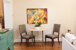 To the left is the home’s original living room, which is situated on the corner of the house. Three windows, plus a French door that leads to a covered portico by the driveway, help to bring light into the space, which has traditional 8’2″ ceilings. The Irons made the most of the available natural light by removing the original heavy drapes and installing woven wood shades, and opened the space by replacing window units and radiators with central heating and air. They also pulled up carpet and restored the home’s original oak floors. The walls are painted an airy robin’s egg blue and the room’s color palette of aqua, coral and green, grounded with soft golds and neutrals, is repeated throughout the house to enhance the flow from one room to the next.
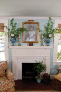 A gold-framed childhood portrait of the Irons’ daughter, now 24, hangs above the white brick fireplace. The portrait is a pastel by Lynchburg artist Ethel Ferrell—who also did many of the portraits at Virginia Baptist Hospital—and since Jay is a Lynchburg native, it seemed fitting to have a work from her.
Next to the fireplace, a patterned club chair rests upon a pale green Jaipur rug. Paula explains that the chair’s pillow has been slightly squashed by “Carley, the Red-Hot Smokin Pug,” their family pet who was named after a character in the movie “Talladega Nights,” and who likes to look out the window from this perch. Across from the fireplace, a sofa accentuated with coral pillows sits beneath an oil painting by Charlottesville artist James Brewer.
A Hickory Chair cane bench sits beneath one window, near a watercolor by Roanoke artist Eric Fitzpatrick. The bench is upholstered in a green fabric with a sea coral pattern, and matches a wing chair across the room. Next to the wing chair is a walnut secretary from Jay’s family farm outside of Lynchburg. The piece is from the late 1800s and still has the original glass in its doors.
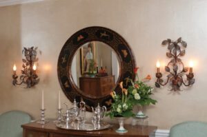
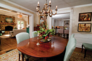 The adjacent dining room features paneled wainscoting topped with shimmery champagne-colored walls, done by local artistic painter Nene Roe. “She’s my neighbor and she can paint anything,” Paula says. Roe had painted a faux finish on the walls 10 to 15 years ago, “when they were all the rage,” says Paula—and she loved it. But when the adjoining great room was added on, the dining room became darker, so recently Roe updated the original buff paint with a gold wash. The room features art from antique stores and local artists, including a piece by Gari Stephenson, and an abstract mixed media by Mary Boxley Bullington. The furniture is mostly antique, with a mahogany farm table from Jay’s family farm, and a corner cupboard from an antique store in Brownsburg. The traditional furniture is complemented by several contemporary pieces. The dining room chair frames are from Roanoke-based furniture maker Frank Chervan, Inc. A Masland rug in shades of green and gold sits beneath the dining set, while overhead is a fun chandelier, which Jay bought for Paula as a gift. “Jay has a good eye,” Paula says with a smile.
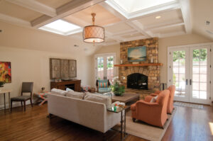
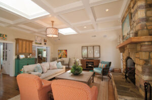 The dining room leads into the heart of the home, a great room built in 2013, where the Irons spend much of their time with family and friends. Originally a covered patio, the Irons first enclosed the space and added skylights to create a sunroom. The sunroom got a lot of use, especially in the morning while drinking coffee and watching the morning news. She says, “We really enjoyed having that little extra space—it created a little more flow.” For this recent renovation, they doubled the size of the room and vaulted the ceiling, taking it from sunroom to great room. Paula’s design inspiration came from a picture of a room with a coffered ceiling that she found online and gave to Matt Prescott of Prescott Construction Company, who handled the renovation. The Irons worked with Prescott to bring light into the space, using high, coffered ceilings, plenty of windows and patio doors, and repurposing the skylights.
 The wall color is Benjamin Moore’s Manchester Tan, painted in half-strength on the walls, and one-quarter strength on the ceiling—a trick design professionals use to adjust the saturation of color in a room. Again, Paula gives credit to Stephenson and Roe, “the color gurus,” who helped select and test paint with her. The effect is crisp and clean, and subtly highlights the details of the coffered ceiling.
The fresh color palette of the furnishings from the other rooms is repeated here, with a pair of coral club chairs, a funky turquoise Asian wine cabinet, two upholstered X- stools that frame the TV, and a scattering of aqua pillows and ceramics. A soft, woven rug in a neutral shade grounds the furniture, with metallic pops from a pair of mirrored tabletops by Brian Lawrence at Artistic Metals, and a cleverly designed TV cabinet. Designed by John Davis, the cabinet conceals a large flat-screen TV and looks as if it’s made from an antique mirror, but is actually an anodized aluminum with a finish applied by Roe. The result is not only creative, but practical as well. Paula says, “If we’d gotten real mirror and then antiqued it, it would’ve been really heavy.”
Across the room, a granite-topped cabinet runs along a row of windows which face the patio. Above the counter hang a trio of green glass pendant lights from Williams Lighting Gallery, while below there is a mini fridge, icemaker, and various drawers and cupboards. The room features art from local and regional artists such as Sherri Morris Barrett, Tom Lawson, Susan McAllister, Vera Dickerson and Mark Watts.
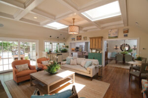 The focal point of the great room is a large wood-burning fireplace made of Tennessee Crab Orchard stone, with a heart pine mantel. The fireplace is part of a two-sided chimney, with a separate hearth outside on the patio. The stone continues onto the patio, which is also part of Matt Prescott’s 2013 renovation. Here, a grouping of bronze patio furniture faces the outdoor fireplace. The outside mantel is mahogany finished in a marine varnish to protect it from the elements. Behind the furniture is a six-foot brick retaining wall, softened by lush potted plants, which frames the space and provides privacy from the road. The upper lawn is planted with a variety of evergreens and deciduous ornamentals to provide year-round interest. The fireplace allows the Irons to use the patio for much of the year for entertaining, which they love to do. Adding to the enjoyment is the patio’s other big attraction, an impressive pizza oven that was inspired by a similar model Jay saw during a trip to Montana. The wood-burning Chicago Brick oven weighs about 1,000 pounds and took six men to install. It’s set into a brick al fresco cooking center that extends from the retaining wall, atop a soapstone counter that’s also home to a built-in Lion gas grill and a recessed drink cooler. Below the pizza oven is a large cubby for storing firewood. A stainless steel kitchen prep cart provides extra counter and work space, and outdoor speakers complete the open-air entertaining space.
 Work on the great room and patio was combined with a much-needed kitchen update. When the Irons moved in 1993, they did what Paula describes as a “quick fix” in the kitchen, doing a few basic spruce-ups that included replacing an avocado green electric oven. “It was probably all the rage in 1970,” says Paula. A few years later, they did a small renovation to the galley kitchen. Then in 2007, the Irons had architect Jennifer Smith draw up plans to double the kitchen’s footprint. Remodeling the sunroom and patio provided the perfect opportunity to simultaneously reconfigure the kitchen and put Smith’s plan into action, resulting in improved light and layout throughout the rear of the home. The new floorplan works well for the Irons’ active social life, allowing them to host events for the various supper, wine, book, and garden clubs they enjoy.
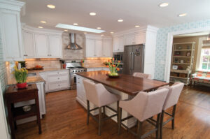
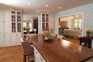 The updated kitchen features cabinets from Custom Wood Products, which are painted a soft white and finished with a faint mocha glaze to accentuate the details. Countertops are gray granite, except for the island, which is capped with walnut. The island is surrounded by four linen-covered barstools accented with nailhead trim. The avocado electric stove is long gone, replaced by a Dynamic Cooking Systems gas stove, along with a built-in microwave, convection oven, and warming drawer. The appliances and range hood are all stainless steel, which breaks up the white cabinetry and nicely complements the aqua and white geometric wallpaper from Clarke & Clarke. The Irons made sure that the new space had plenty of light by installing lots of recessed lighting and under-cabinet task lighting, as well as another skylight above the range.
Across from the main kitchen workspace, the doorway to the dining room is flanked by built-in cabinets. They were already in place when the kitchen was remodeled, and were refinished with the same paint and glaze as the new kitchen cabinetry. Several solid doors were also retrofitted with glass panels to break up the expanse of wood.
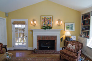 The kitchen is the central hub of the home, opening to not only the dining and great rooms, but also toward the foyer of the house. Here, a small pass-through, outfitted with white bookshelves and an upholstered bench beneath the window, leads to a den addition built in 1987. Apart from the 1970s kitchen update, Paula says that when they arrived in 1993, “The house really hadn’t been touched other than that addition.” The den was originally built as a mother-in-law suite, and for a while the Irons tried using it as their master bedroom, but they had small children at the time and found it to be too far away from the upstairs bedrooms. They converted it into a den, and today it is used as guest quarters for Paula’s father when he visits. The room features cathedral ceilings, a fireplace, and a wall of built-in bookshelves with two window seats.
The walls are painted yellow, and while gold and green from the other rooms are present here, the red of the brick fireplace is picked up by an Oriental rug and an armchair upholstered in a funky red leopard print. The room is hung with an eclectic mix of artwork, including another Mary Boxley Bullington piece above the mantel.
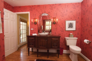 The den’s red accents connect it to the adjacent bathroom, a striking space wallpapered in a moody red Oriental print from Nina Campbell. This full bathroom features a built-in tub, separate shower, and a custom vanity made from a high-legged cabinet topped with a vessel sink. An old-fashioned mirror and a pair of candelabra wall sconces complete the exotic ambiance. While the den’s location makes it a perfect guest room or quiet retreat from the main living areas, the home’s wide doorways, interconnected layout, and recurring color palette keep it from feeling detached.
Over 20 years of renovations by Jay and Paula have preserved the home’s classic Colonial charm and character while adding brightness, space and modern comforts. The result is a chic yet welcoming atmosphere that is equally suited to festive occasions and relaxed family time. With the latest transformation of the home’s key living spaces, the era of dark, outmoded interiors is light years away.
Elaine Stephenson's Interiors, Ethel Ferrell Artist, Frank Chervan Inc., James Bewer Artist, Paneled Wainscoting, Prescott Construction Company, Tennessee Crab Orchard stone
