READY, SET, RED

2025 colors of the year
If there’s one word that represents the colors of 2025, it’s “grounded.” To recap, 2024 was all about the hues of blue. We began that year ready to blow with the wind and go with the flow. Yet, coming off the heels of a tumultuous, storm-tossed year, it’s no surprise that the collective culture no longer yearns to roll with the tides. We now move from sea to land, taking comfort in the earthly colors of nature.
Primer
Color trends tend to reflect what we are seeing culturally in global events, music, art, cinema, fashion and collective emotion. With so much competing for our attention in the form of social media, streaming platforms, political agendas, influencers and gurus, it’s easy to see why many are looking to unplug and “touch grass” as the saying goes. Instead of spreading our attention outward in a million different directions, we are being called to look within and seek inner wisdom in moments of calm reflection.
Luxurious reds are fittingly the top color trend for 2025 across palettes. Ranging from rich brown to deep magenta, these comforting colors exude warmth and complexity, with undertones of plum, leathery brown, velvety cinnamon and red wine. A secondary trend coming down the pike is yellow. Muted shades of yellow are expected to grow in popularity, as this color promotes positivity and effervescence. Time will tell how yellow shows up in 2025 and beyond. The pinks and peaches of yesteryear haven’t disappeared, but they have toned down. Rather than showing up as pops and bold statements, pastels are now appearing more in a soft, supportive role.
Matte and satin sheens offer a depth of texture for a layered look that invites home inhabitants and guests into a world of cozy charm. Without overpowering the senses or competing with other elements in the room, all palettes across major paint brands are nature-inspired and subdued.
Paint colors
PANTONE
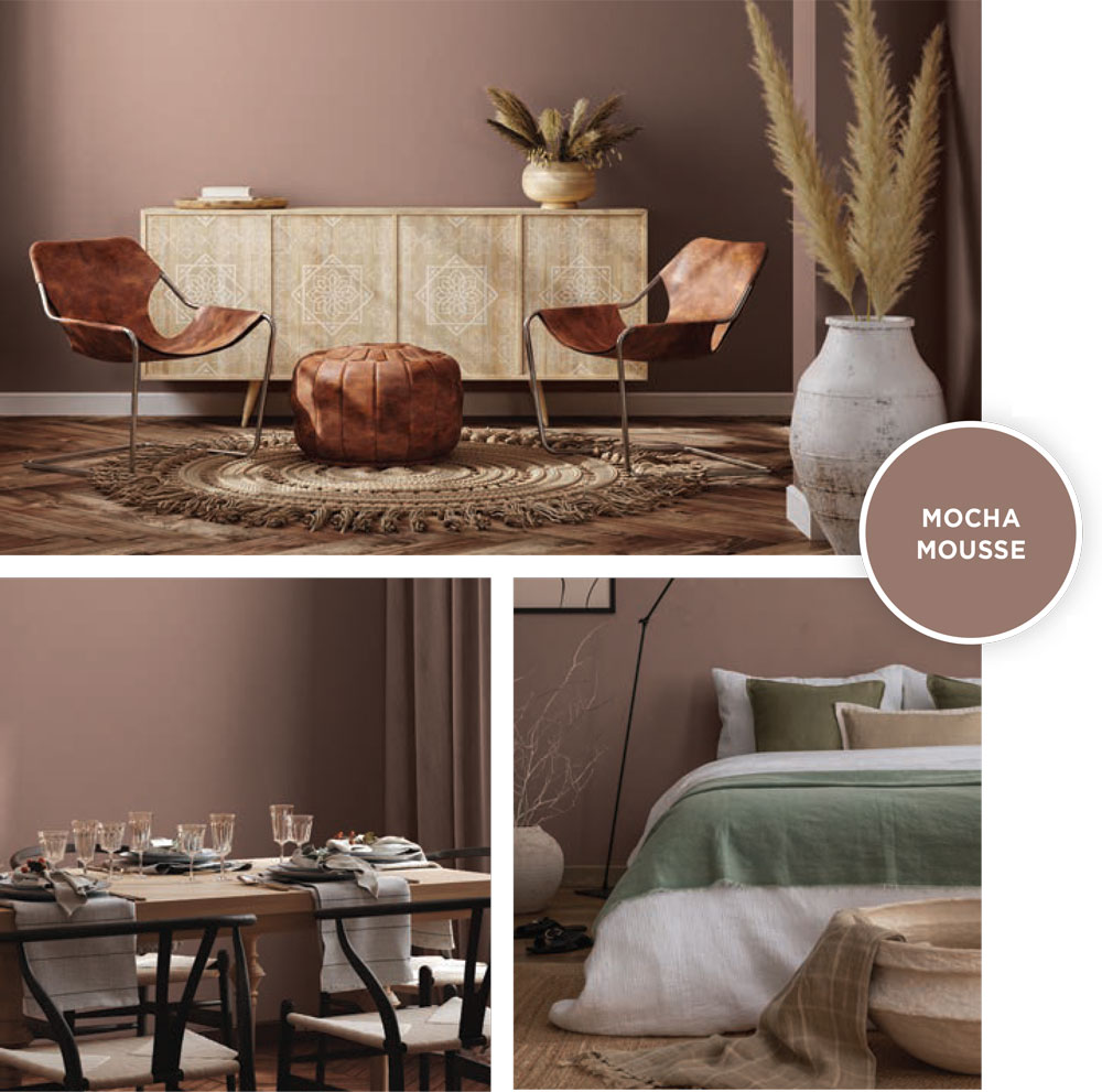
Mocha Mousse has been rolled out as Pantone’s much anticipated color of the year – evoking a sense of “connection, comfort and harmony.” It’s no coincidence that this rich hue inspires associations with treats like chocolate, cacao and coffee. The light and airy, yet simultaneously grounding tone encourages onlookers to take pleasure in life’s simplicity, embrace the contentment of the moment and enjoy harmony with cherished companions.
Not too much of a departure from last year’s Peach Fuzz, Mocha Mousse delves deeper into the decadence of a special dessert. This brown is predicted to show up in monochromatic schemes and in pairings with familiar peachy pastels, along with many other vibrant shades spanning the color spectrum. We can expect to see Mocha Mousse with golden accents for a sophisticated feel and alternatively with reeded and cane wood for an organic earthy vibe.
Each year, Pantone tunes into the “global zeitgeist” and chooses a color that represents the collective mood and future hope. According to this year’s themes, the desires of 2025 are pleasure, comfort and community — all things that Mocha Mousse delivers by reminding us of our beloved sweets.
 BENJAMIN MOORE
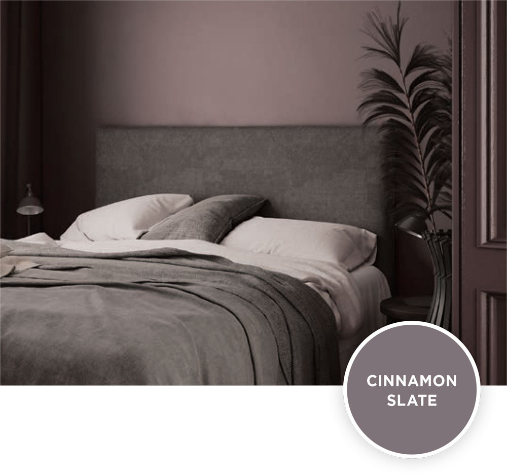
Epitomizing this year’s moody red trend, Benjamin Moore chose Cinnamon Slate as its color of the year. Encouraging us to “embrace the beauty of quietly colorful hues,” this color aims to create “smooth familiarity.” All tones in this palette have been chosen with comfort and warmth in mind. Other 2025 colors are Sea Salt, Leather Saddle Brown, Chowning’s Tan, Tissue Pink, Stained Glass, Ashwood Moss, Rosepine, Paris Rain and Glacier White. These colors can work individually or in tandem for cohesion and effortless transitions from room to room.
 BEHR
BEHR
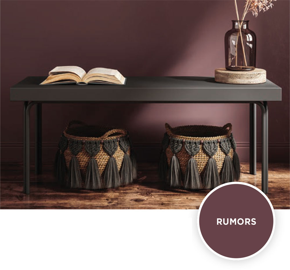
Continuing down the red dirt road, Behr selected Rumors, a “deep ruby red” as its color of the year. The Behr palette strives for versatility with many other shades, ranging from cool to warm. The idea is to offer enough options to “express any style and enhance any environment.” Greens, blues, reds, purples and pastels can all be found within the palette. Following suit with most of the other colors of 2025, all hues are muted. Along with Rumors, other options include Nutmeg Frost, Blank Canvas, Even Better Beige, Frosted Jade, Rock Crystal, Jackfruit, Oxford Street, Wild Truffle, Boreal, Aerial View, Colorful Leaves, Gardener’s Soil, Amazon Jungle, Black Sapphire and Cracked Pepper.
SHERWIN-WILLIAMS
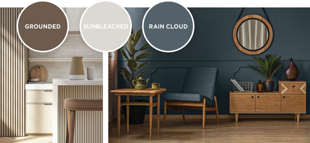
Rather than homing in on one color, Sherwin-Williams opted for a “color capsule” to celebrate 15 years of “Colors of the Year.” Color Marketing Director Sue Wadden says this year’s colors can embody any design style with a “balanced and usable assortment of shades.” The color capsule includes Grounded (a rich and muddy brown with red undertones), Sunbleached, Chartreuse, Bosc Pear, White Snow, Rain Cloud, Clove, Malabar and Mauve Finery. Sherwin-Williams picks have a grounding element intended to blend trendiness with timelessness. Many of the hues are reminiscent of the popular neutrals of past years, but – like the rest of the palettes – more subdued.
 PPG
PPG
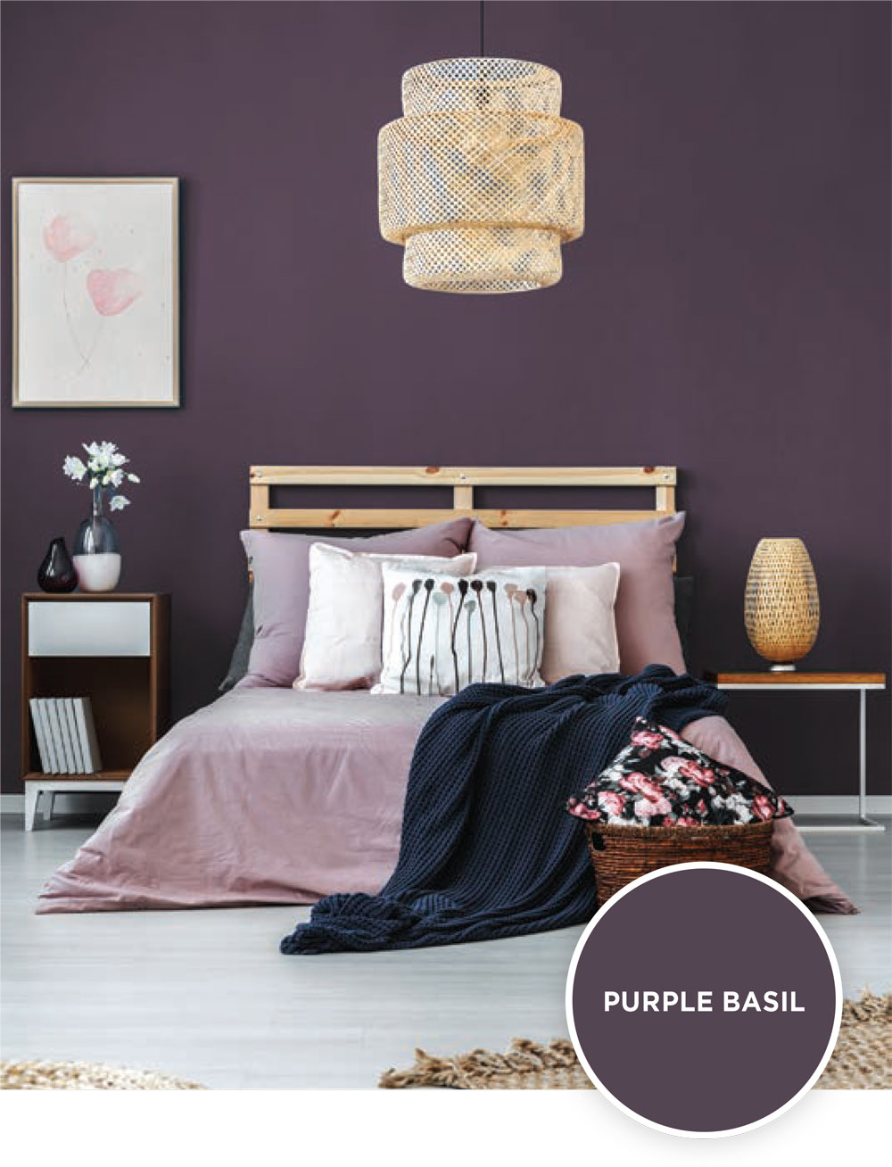
Rather than one single palette, PPG’s color picks focus on a central theme that encapsulates colors grouped to represent four different design styles. The overall vibe is “Kinetic.” PPG anticipates “extraordinary new developments” to unfold over the next decade, moving us to activate and adapt. PPG’s color of the year is Purple Basil, which straddles the line between the “calming qualities of blue and energetic warmth of red.”
The Extra Celestial palette nudges us toward “self-trust,” featuring stellar shades of purple and blue, among others emblematic of the cosmos. These include Milk Paint, Shaded Whisper, Sterling Silver, Stained Glass, Red Red Wine, Warmstone, Cosmic, Kimono, Magic Spell and Starless Sky.
The Bio-Fuse palette, which features a biophilic design style, sets out to inspire optimism for a “better world” through the exploration of “nature, science and futurism.” Colors consist of Storm’s Coming, Slate Green, Brandy Snaps, Serene Scene, Bark, Aquamarine Dream, Vintage Vibe, Gray Heron, Dark Green Velvet and Artillery.
The Artificial palette highlights a postmodern aesthetic that will likely appeal to the Gen Z crowd with its youthful tones. Although its nothing close to neon, this palette is about as close to “joy core” as we’re going to get this year. Created with the help of AI, this palette blurs the line “between what is considered real and unreal” and includes Tarreyton, Vining Ivy, Magic Magenta, Cranapple, Oyster White, Purple Parlor, Sharkskin, Blue Calico, Gold Buff and Rabbit’s Ear.
The Earth & Archive palette appeals to organic modern enthusiasts, showcasing a variety of neutral, stone and earthy shades, including Life Lesson, Sandpaper, Honey Graham, Welcome Home, Hummus, Seriously Sand, Mysterious, Eagle Eye, Hip Waders and Aldabra.
The final coat
This year’s trends aren’t so much a festival of color, as they are an observation of color. In honor of calm coziness, ancestral heritage hallmarks and nature elements, the palettes of 2025 offer a quietly elegant background that transcends time. Altogether, these colors set the scene for inward reflection and a homecoming to our instinctual nature.
The colors of 2025 will likely show up on walls and cabinetry, while other design details like textiles, statement furniture, art, accessories and family heirlooms take center stage. Subtle paint tones suggest a return to more traditional design styles and the resurgence of classic features like antiques passed down through generations, historical and cultural motifs, old-fashioned masonry and glass artistry.
We can expect to see folk-inspired nods to whimsical nostalgia and old world charm. Predicted trends point toward an homage to days gone by. Specific features we might see in abundance in the coming year are handmade crafts, quilts, embroidery, stained and fluted glass, mid-toned and darker wood with traditional craftsmanship, painted tile work and wallpaper showing up in kitchens and pantries. The colors of 2025 will offer a backdrop to support these traditional items of character on display.
With our feet on the ground, we take comfort in the ancestral roots that support us on a solid foundation. Like the lifeblood that runs through our veins, earthy reds and nature hues remind us of where we come from. No matter how you paint it, all roots and red dirt roads lead back to HOME. ✦
“color capsule”, “Kinetic”, Cinnamon Slate, color trends, earthly colors, encapsulates colors, luxurious reds, Mocha Mousse, rumors