Stylish Living: Arranging the Furniture in Your Living Room
 These days, the (capital L, capital R) Living Room is that place in your home where you most often entertain guests. It might take the form of a traditional formal parlor or be one part of a greater entertaining space sharing equal billing with the kitchen. Either way, having a functional and stylish living room helps you create a comfortable and welcoming space for your friends and family. When arranging the furniture in your living room, approach the task with a fashion stylist’s eye and play up your room’s best features to dress it for success.
Focus Hocus-Pocus: Creating Illusions
Every room needs a distinct focal point to define its space and use. Be it a fireplace or a beautiful mountain view, you can arrange your furniture to complement it. Don’t be afraid to move your furniture around by the seasons in order to highlight the room’s natural assets. In winter, perhaps the furniture admires the hearth and fireplace; but in spring, it sashays so the rhododendron on the Blue Ridge can steal the scene through the view from your large bay window.
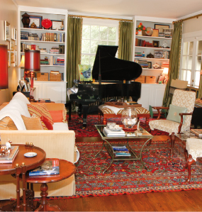 After you’ve arranged your furniture according to your room’s focal point, look around, focusing your attention on details such as furniture heft and lamp heights. If your eyes go on a rollercoaster ride around the room, a stack of books on an end table can raise lamps to equal height and a potted palm nestled behind the squatty chair that sits opposite a more substantial one helps even things out. Create the illusion of a balanced room by shoring furnishings up with props to achieve a balanced look.
You can also create order and instill a sense of calm while downplaying irregular features like radiators, alcoves, beams, awkwardly placed doors and mate-less windows. You don’t have to dress the room like identical twins to create symmetry. Instead of being matchy-matchy, a more modern approach is to create the illusion of symmetry by grouping similarly sized, shaped or colored paintings and objects so that they take up the same amount of visual space on either side of a fireplace or window. Items don’t have to match, just relate. Balance something tall with a grouping of smaller and shorter items. Nestle the items tightly to increase their visual weight and create balance
A well-placed mirror can do wonders for reflecting light into dark corners and making a space feel larger. Every living room needs one. Make sure that it is placed so that it reflects something pretty! Likewise, all white, clear or mercury glass objects do a great job of reflecting light around your room as well.
Have a not-so-great piece of furniture? Paint it the same color as your walls and watch it tactfully blend into its surroundings and vanish right before your very eyes. Blah mantel? Paint all elements of it same color as your walls. If your fireplace has decorative molding, paint it the same color as the walls so that it doesn’t look like a picture-less frame.
Lean and layer mirrors, art or pictures for a warm and casual look on your mantel or bookshelves. And, who says you have to have a fire in the fireplace? Try a fiery orange mum or a basket of maple leaves and pinecones instead.
Zone Out
Consider the entire shape of your room including its length, width and height. If your room has prominent architectural features such as a fireplace, large doorways or numerous windows, use those elements rather than the walls to define the seating area. Open floor plans and long, narrow rooms create unique challenges. Because there is so much going on in the shared space, create distinct activity zones and anchor each area with a rug. A soothing color palette ties the entire space together.
Living rooms don’t stand alone as an island in your home. Think about what is going on in the living room itself and its neighboring room as well. Stand in one room and study the adjacent one. Do the two spaces flow together and feel like a natural extension of one another? Consider using your living room’s color palette or similar window treatments to tie two rooms together. Carry accent colors from one room to the next with accessories and use the same hardware metals from room to room for the most cohesive look.
 Show a Little Leg
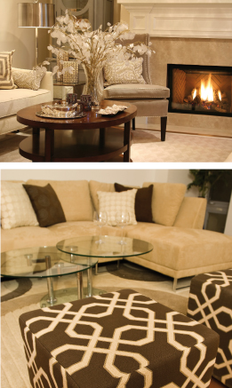
Furniture should be proportionate to the size of the room, so don’t be afraid to show a little leg if you have a small living room. Furniture legs, that is! Furniture with tall shapely legs visually increases the size of your room because light is able to freely mingle all around. Bring furniture in and away from the walls and, again, define the seating area with rug so that your room doesn’t give the appearance of having unmoored, floating furniture.
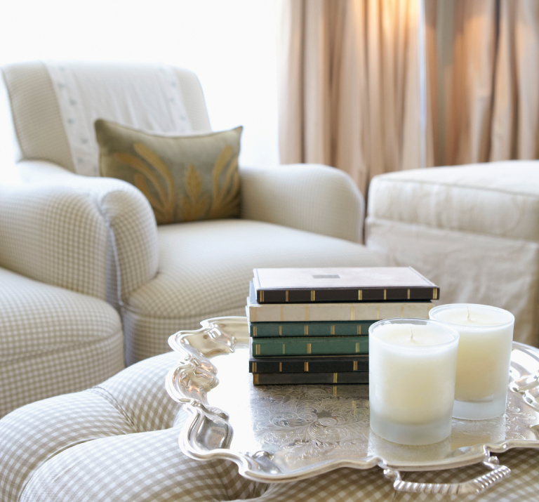
An L-shaped furniture arrangement is more casual and is well suited for rooms where television will be viewed. A classic face-to-face furniture arrangement with a sofa flanked by a pair of chairs encourages conversation. Provide a small stool or table beside each armchair on which guests may rest their glass. A coffee table or ottoman-with-tray in the center of the group also provides a convenient landing pad for reading material and refreshments. Place furniture so that there are easy walkways among and between so guests don’t have to zig-zag just to have a seat. Pull furniture a few inches away from the walls and windows so they aren’t smooshed against them like dormitory furniture.
Timeless Appeal
The practical little black dress of decorating is to keep things classic by choosing neutrals for walls, furniture and rugs. Have fun and play up current trends through your accessories. Don’t go overboard with trends; just add a touch of whimsy. For instance, paint your walls a warm and inviting creamy white. Next, choose a favorite color as an accent color. Perhaps you can paint the back of your bookcases in it or use it in your draperies. Have your accent colors show up here and there throughout the room in your lamp bases, picture frames or a decorative clock on the mantel. Finally, add a touch of that accent color’s complementary shade in your throw pillows or on a tray resting on the ottoman. Upholster the sofa in a solid; your chairs in a stripe, geometric or floral; and perhaps the ottoman or lamp shades in an animal print.
Less is More
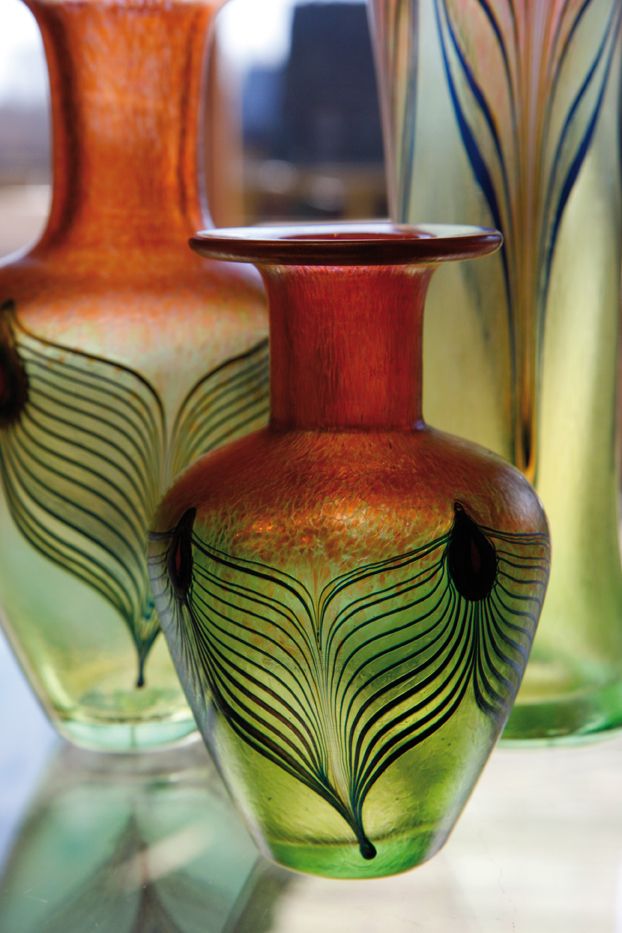
Accessorize your home as you would an outfit: drawing attention to its best features and downplaying its eyesores. Coco Chanel advised women to get dressed, put on their accessories and then “take one thing off before leaving.” Her rationale was that we all have a tendency to overdo it when it comes to accessorizing. When it comes to doodads and curios, a little goes a long way. So that your home doesn’t look like a tchotchke shop, group your collections and consider editing them to avoid knick-knack gluttony. Only display the most important items and they’ll have a brighter opportunity to shine and become an interesting conversation-starter at your next party.
