That Elusive Paint Color: Designers Rave over Faves
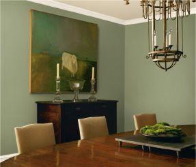
 We all know that paint is one of the quickest, easiest and most economical ways to transform our interior spaces. But the choices, oh the choices! Picking a color from the endless array of chips and bulky fan decks can send even the most decisive homeowner into a swivet. Too light? Too dark? Too yellow or pink? Here, some of our area’s designers and other interior specialists generously share some of their favorite colors and ways to use them to freshen up our homes. HOME offers them to you as a starting point for your next interior paint project. Enjoy!
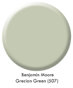 “I love Benjamin Moore Grecian Green (507). It is a fabulous, soft green—very soothing and fairly neutral.”
Elaine Stephenson
Elaine Stephenson Interiors
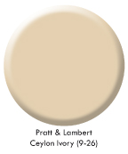 “Pratt & Lambert Paint’s Ceylon Ivory (9-26) has been the most popular color with Skyline’s customers. It coordinates well with organic colors, such as Light Olive (18-23) and other earthy greens and muted shades. Where is it being used? Everywhere! Ceilings, walls and trim!”
Carolyn W. Hare
Skyline Door and Hardware
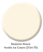 “Color is my joy! I knew this color would to be a hit last December: a bright kelly/jade green, which is beautiful with white and neutral backgrounds. It is fresh and clean; it works great with oranges, purples, blues and blue-greens—but is especially beautiful in a room with white enamel paint trim and Benjamin Moore’s creamy white Vanilla Ice Cream (2154-70) on the walls. We are now seeing kelly green in glass lamp bases and some fabrics.”
Diane Poff
diane poff interiors LLC
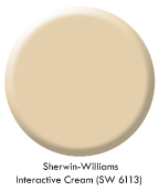 “Two paint colors that I find especially versatile are Sherwin-Williams Interactive Cream (SW 6113), a light-capturing neutral that never seems too yellow or too gray, and Benjamin Moore Fernwood Green (2145-40), a near-neutral that complements almost any other hue from bright to dark. Newer eye-catching colors usually derive from clothing trends and often lend themselves to use for an accent wall, alcove, or entryway. Benjamin Moore Coral Spice (2170-40), for instance, freshly exemplifies fashion’s current fondness for peach tones.”
Mary Jean R. Levin
Halifax Fine Furnishings
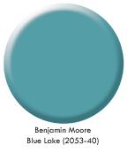 “The appearance of any space can change drastically with ease and little expense just by adding a pop of color. One of my favorite palettes for 2012 is the vibrant range of teals and blues. Bold jewel tones and brave indigos coupled with white will add a splash to any room. Some of my favorite Benjamin Moore paint colors are Blue Lake (2053-40), Lakeside Cabin (1658), and Van Deusen Blue (HC-156).”
Kris Willard, ASID
Interiors By Kris
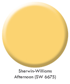 “After much consideration, the paint color that I would love to share is Afternoon by Sherwin-Williams (SW 6675). I have this color in my own family room. This fantastic, rich yellow has a tint of orange in it, making it a very happy color! Best of all, it goes with any other color you can imagine putting with it: browns, blues, greens…it’s very versatile! Pair it with gray for the latest trendy combination, or pair it with a crisp blue for a French Country look—the possibilities are endless. The lesson here is that yellow can be a happy neutral for anyone wanting more fun than a typical beige.”
Susie Whiteside
Whiteside Designs
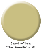 “I love the Sherwin-Williams color Wheat Grass (SW 6408). It is spring and summer wrapped into one beautiful color, keeping dull winters alive. It is such a fun, happy color—I’ve actually painted a guest bedroom and home office in that color! It’s very versatile; you can pair it with reds, oranges and corals if you want to be bold, or you can soften it by using grays and off-whites.”
Jackie Jordan, Director of Color Marketing
Sherwin-Williams
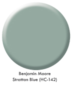 “My favorite paint color is Benjamin Moore Stratton Blue (HC-142), a slightly dark sea-glass color that literally goes beautifully with any other color. Pinks, roses and corals bring out the warmth and offer wonderful contrast, while shades of more vivid greens and blues create monochromatic flair. Pairing it with chocolates and creams gives a room quiet elegance. New fabric collections from Jane Churchill and Manuel Canovas are featuring many of these color scheme combinations. As with other paints in the Historic Color Collection from Benjamin Moore, these colors are timeless. I painted my office Stratton Blue in 1998 with White Dove (OC-17) trim. Six years later, I painted our master bedroom this same color, with stained trim, and I never get tired of looking at it!”
Tricia Cronise, ASID
Stedman House Interiors


