The Pursuit of Tranquility | Combining Traditional and Modern Aesthetics in a South Roanoke Home
Photography by Kathryn Feldmann
When they arrived in 2019, Amanda Marko and her family scouted out a large brick Colonial in a prime neighborhood in Roanoke. The Markos loved the proximity to downtown Roanoke’s amenities, as well as how the lots overlook the mountains surrounding the Blue Ridge Parkway. Amanda, an artist, and former executive communicator with ties to Capitol Hill, was looking for the challenge of a new creative project.
The house, with its traditional facade, winding gated drive, and large yard was exactly what the family was looking for. They have a history of selecting homes with very traditional exteriors; however, their taste in interior design, honed over the years and lovingly curated, is anything but conventional. “I saw this house and felt immediately that it was a house I could make into a space we would love,” recalls Amanda. “Our previous houses were very similar and so I sort of had a template of how to take a traditional-looking house and make the interior something very different.”
Amanda’s design goal was to make the interior as modern and minimalist as possible. “We have always been particular about the space we live in,” says Amanda. “At home we gravitate towards interiors that are very uncluttered and orderly that convey a sense of serenity.”
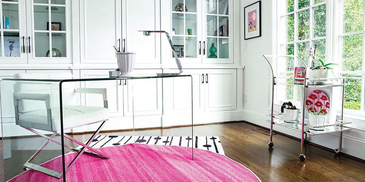
The home has a transitional floorplan, with each room open and flowing into the next on the ground floor. Large walls of oversized windows across the front and the back of the home produce an interior that is flooded with light. Amanda had intentionally refrained from any window treatments. The walls are painted a uniform crisp white (“Chantilly Lace” by Benjamin Moore). The modern aesthetic, according to Amanda, has its foundations in clean white walls and contemporary light fixtures.
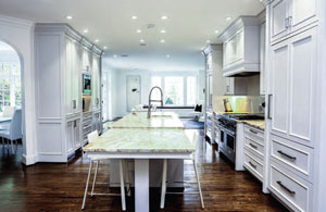 Changing the colors in a home can sometimes be a challenging undertaking. It’s so much more than just painting the walls: Homeowners must consider trim, cabinetry, tile, countertops, and fireplace surrounds in order to create a cohesive design. This is a special challenge in transitional homes because rooms open into each other, and the space can easily become disjointed. For example, when they purchased the home, the kitchen featured a warmer palette of honey-colored cabinets, backsplash and granite that wasn’t cohesive with the rest of the downstairs. Amanda found that once she painted the extensive wall-to-ceiling cabinets and trim, the granite countertops with swirls of tan and grey looked great with the color she’d selected (Benjamin Moore’s “Shoreline”) and really the only piece that needed to be changed was the backsplash. Fortuitously, she’d saved some of the tiles from her previous home where she had used the same palette, so she was able to use materials she already had on hand. The resulting space blends seamlessly with the living room, family room and dining areas.
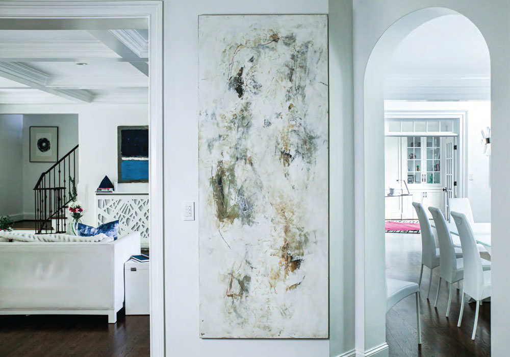
The living room features white leather seating with navy blue accents. The large abstract painting and narrow custom console table were specifically designed and placed to cover an unsightly HVAC return. Amanda has softened the stark white of the leather sofas with soft faux animal throws which are the landing place of choice for the family’s three Italian Greyhounds, Ava, Ivey and Olive.
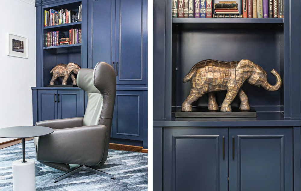
The family room, with its panoramic views of the mountains, is a beautiful, light-filled space. The built-in shelves flanking the fireplace provide display space for sculptures and books, and the furnishings are also white leather. An extra-long couch and large ottoman, and two small side chairs, provide the perfect spots for watching a movie, relaxing by the fire, or simply enjoying the views.
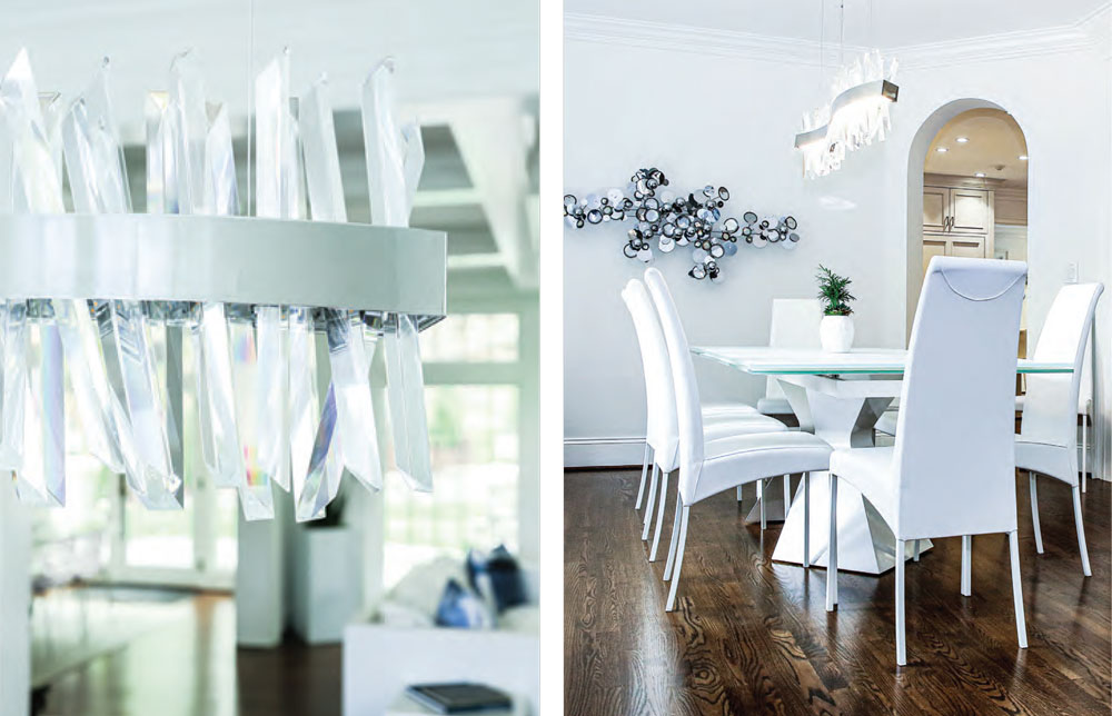
“When we lived abroad several years ago, I took some design courses at the university. I knew I had an eye, but wanted to learn more theory, to have a foundation on which to build,” Amanda says. “I learned to choose furniture that was structural, almost like pieces of art in their own right, but also that would give us flexibility so that we could use them in different ways in different houses.” The dining room buffet, purchased several years ago from Roche- Bobois, a French company specializing in fine contemporary furniture, is a perfect example of this. It is beautiful structurally, with its sculpted doors and ice-white surface. In this house, it functions as a buffet; its sliding doors hide Amanda’s grandmother’s heirloom china, but, as she points out, it could also be a focal point under artwork, or a table behind a couch. “Versatility is key,” says Amanda, because the family has moved six times in the past 10 years. The Italian dining room table and white leather chairs were selected for their beauty, but also for their comfort and function, enabling the Markos to seat 12 diners as easily as four.
Complementing the “icy” feel in the dining room is an original C. Jer wall sculpture. (C. Jer is a metalwork company of wall art and accessories named after artist Curtis Jer .) The metallic and mirrored surfaces reflect the prismatic light from the chandelier overhead. After painting, one of the first things Amanda changed was the home’s light fixtures. “Really think about light fixtures if you are trying to embrace a more modern aesthetic,” she says. “They’re easier to change out than you’d think, and it should be the top priority to change the look of your space.”
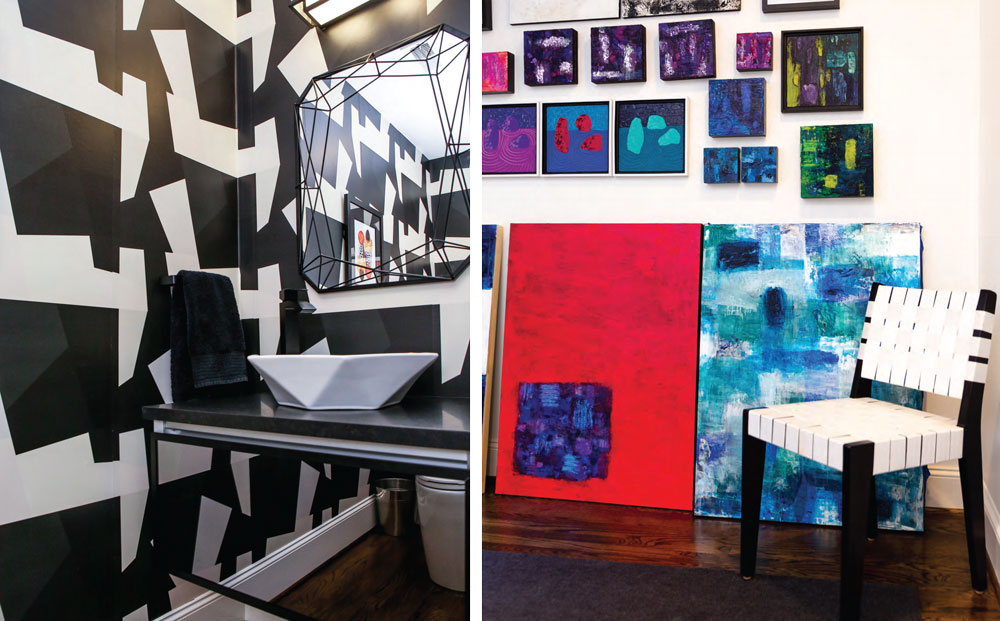
Art in the Marko home is also a careful and deliberate business. The family travels extensively and art is their favorite souvenir, so hanging around the home is a veritable travelogue. “We like having a connection to the artists,” Amanda says. “I’ve gotten to know them either in person or online. That way the art in our home feels more personal.” Art inspired the powder room for example, where Amanda has complemented the Asian-themed wall art with bold black and white wallpaper that resembles origami, and a mirror and vessel sink with strong geometric lines also suggestive of that art form.
Amanda is also an artist in her own right. She has converted a sun-filled room on the home’s lower level to a full-fledged gallery. The long walls and natural light make this space the perfect place to display the colorful abstract oils that she creates. Amanda paints in her in-home studio and exhibits her work in her home gallery, locally at Magnolia and WyndRose Eco Boutique, and online at Saatchi Art.
The home’s lower level holds a treasure trove of spaces: a gaming room, the art studio, and a luxurious bar and “media lounge.” When they purchased the home, the Markos saw opportunity in the large empty room with attached bar and wine storage. It was perfect for a space they’d always wanted and envisioned: a combination of entertaining space, a full bar that could make most restaurateurs drool, and a state-of-the-art entertainment/ sound system … hence, the media lounge. At first Amanda thought that they would need professional design assistance, but as they talked about it, they realized that they could design the space together, dividing up the technical and creative aspects. Once careful diagrams were drawn and the installation of everything from the projection TV entertainment system to the surround sound, to the dropped ceiling lit by hundreds of tiny twinkling fiberoptic lights was complete, Amanda designed the furnishings. She commissioned local artist Maggie Perrin- Key to paint the mural whose colors match the drop ceiling and the warm gold of the speakers. Amanda also ordered a series of 13 individual pieces of upholstered furniture that can be configured an infinite number of ways. “This is actually the only room we had to buy furniture for,” Amanda says, gesturing to the cozy U-shaped arrangement facing the projection wall. “We wanted a place where we could entertain a number of people, but we could also make it feel comfortable for just our family … For instance, this current arrangement is ideal for family movie nights. I call it the ‘Human Dog Bed.’”
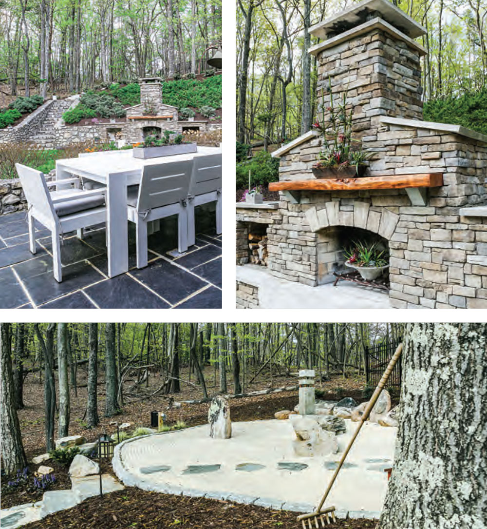
The Markos also spend a lot of their time in the home’s outdoor spaces. When they moved in, the back yard was taken up by a large, paved basketball court, complete with outdoor lighting. Since they are not avid players, they immediately began an overhaul that kept the existing large slate patio with several seating areas, an outdoor kitchen, an al fresco dining area overlooking the terraced back yard, and a stone fireplace. Over the past two years the outdoor areas have been enhanced by ornamental grasses, lots of native plants and pollinator-friendly perennials and shrubs. The Markos also installed a zen garden and meditation space, all of which were featured in the Garden Club of Virginia’s Historic Garden Tour in 2021.
Looking back over the past two years, from the whirlwind of relocating to Southwestern Virginia in 2019, the family has much to be proud of. They have taken a traditional house and made it their own, creating interior and exterior spaces that bring them a sense of tranquility and joy. “It took a lot of work,” Amanda says. “But we use every bit of this home and we are proud of the teamwork that went into transforming it into a space that is both beautiful and functional for the way we live.” ✦
abstract painting, blue ridge parkway, brick colonial, cabinetry, cohesive design, countertops, custom console table, fireplace surrounds, large yard, minimalist, modern, outdoor spaces, oversized windows, panoramic views, Southwestern Virginia, tile, traditional facade, transitional floorplan, trim, winding gated drive
